Eloise Holland, Creative Director at Colbourns, shares her thoughts and insights behind the new 1940 sq. ft showroom in Lots Road and working with Maurizio’s vision.
1. Tell us a little background about Colbourns and the need for a new showroom?
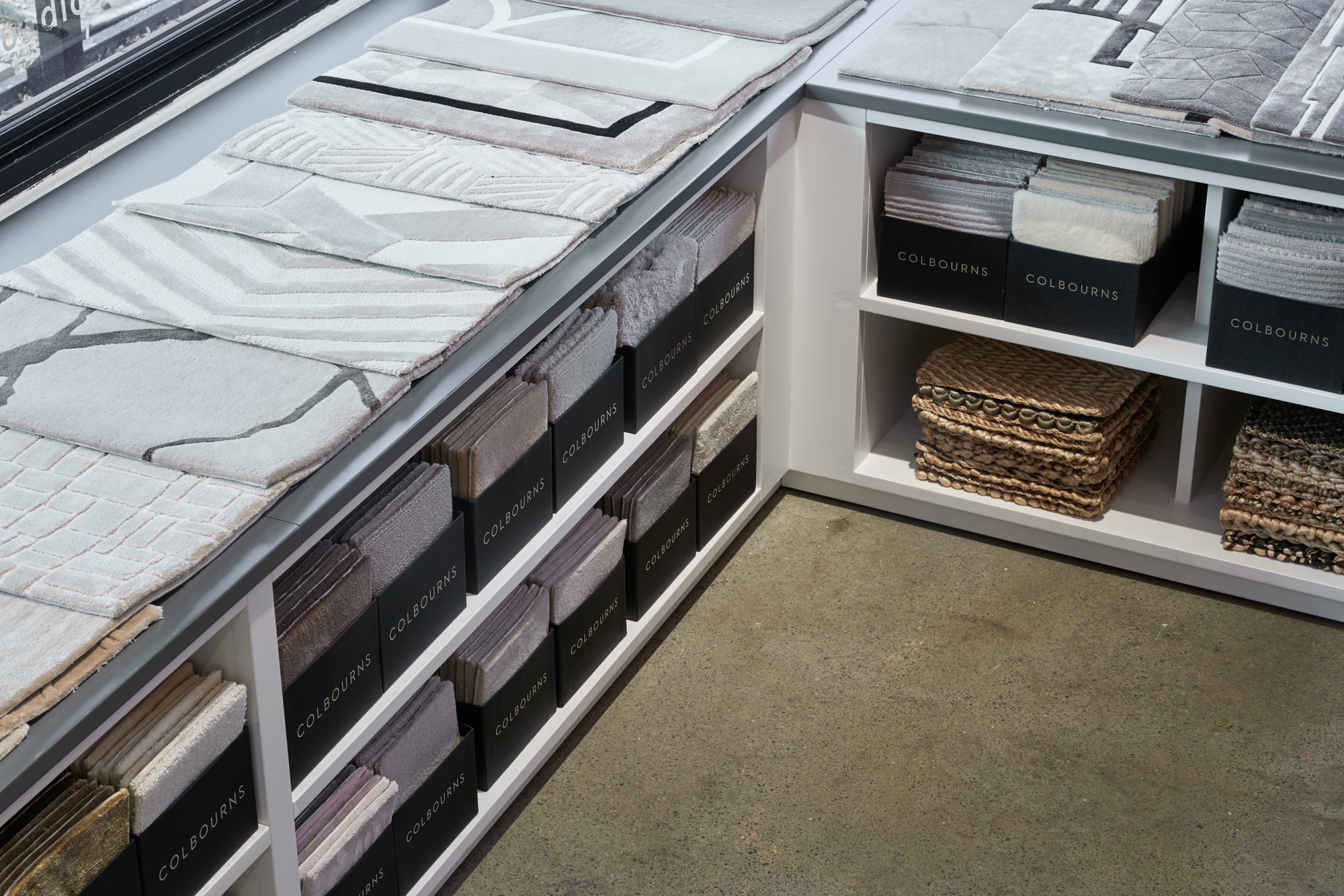
Colbourns is a carpet and rug manufacturer and supplier, specialising in hand tufted bespoke designs, concepts and textures for the luxury market. Colbourns has evolved from the original business, which was PWC International, and we are very focused on providing a brilliant service from start to finish. Our showroom is a reflection of what we think clients can expect from us as a team and from our final product that we install. We have taken care to present our showroom in the same way that we would present ourselves to our clients. Part of the task in redesigning the showroom was to cater for all of our clients, and to become a kind of one stop shop for designers and even end users. We had to make sure that all of our brands worked in harmony, like they would do in any home.
2. What was the brief?
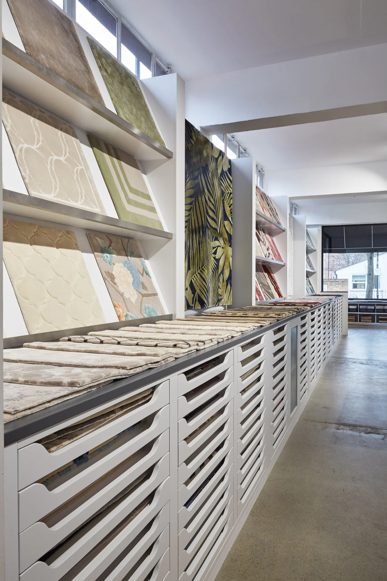
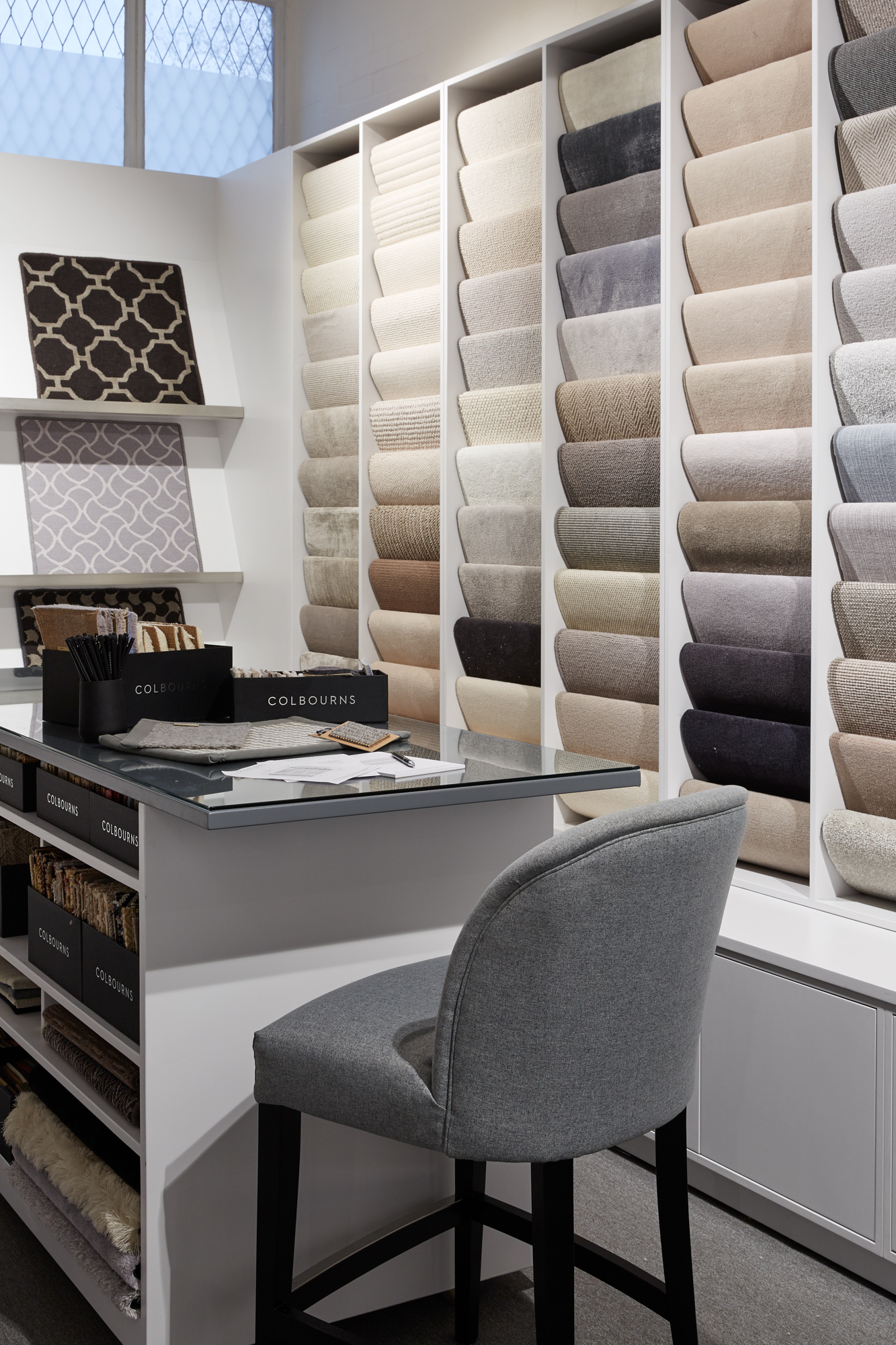
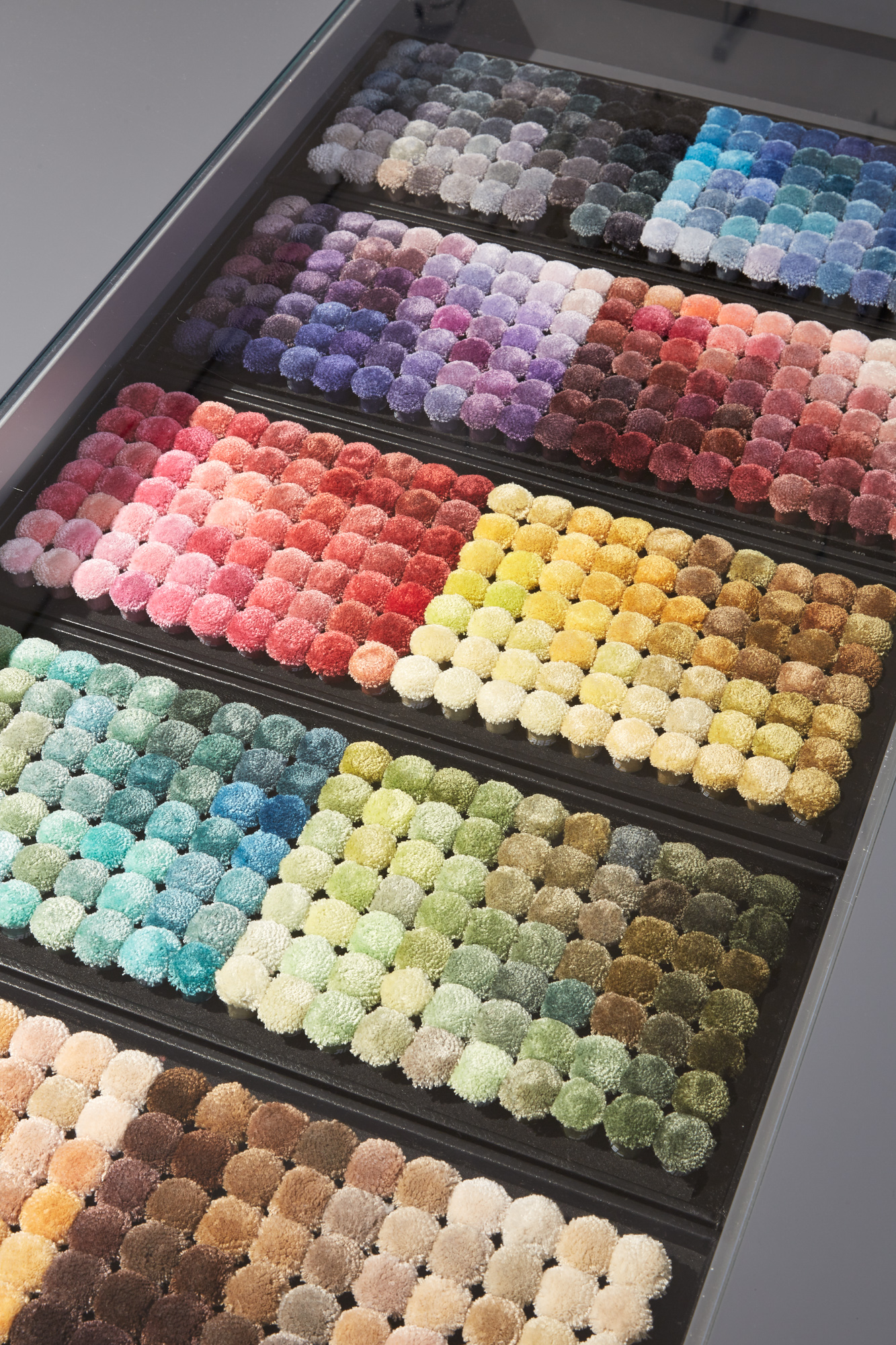
Our brief was simply to create a luxury showroom that reflected our new brand image. We needed a space to celebrate our different manufacturing sectors - hand tufted, machine made & hand crafted. We also wanted to create a studio for the design team that encompassed the way we all work together and we envisaged a space that would be a pleasure to walk into, with clean lines, a riot of colour and inspiration, with a library that designers could use as their resource.
3. How was the brief achieved?
We wanted a fresh start, but we needed to make the showroom functional for clients as well as our team. It was as important for us to create a beautiful place to work in as well as to shop and be inspired in. We talked Maurizio through how we worked individually in each sector, and as a team, how we liaised with clients, how we sat with them and talked through ideas and colours, how we searched for samples and how we greeted people through the door. All of this was important information for designing the perfect space. Combining this with Maurizio's knowledge of the customer journey from his time at Ralph Lauren we have really got the most out of the brief.
4. Is the customer journey a key feature in the design?
Absolutely, part of the reason that we worked with Maurizio was because of his experience and understanding of the clients journey in a showroom. From the first steps into the showroom, to how clients walk through the space to find all the different sectors of our brand, each part was important. Maurizio took all this into account when planning our space. We worked with our branding company to talk though what we feel are the best parts of our company and realised that our stand out feature is our design team. To reflect this we have created a design studio with glass windows that can be seen from the outside of the showroom to allow people to see the hub of the business. The next part of our plan was to create a gallery like space for our rugs to hang. We have planned where each rug would sit and how it would be framed by the wood surround. Our emphasis has been on making this a contemporary showroom that’s inspiring with colour and textures.
5. Can you tell us a bit about the materials, colours and finishes selected and why these were chosen?
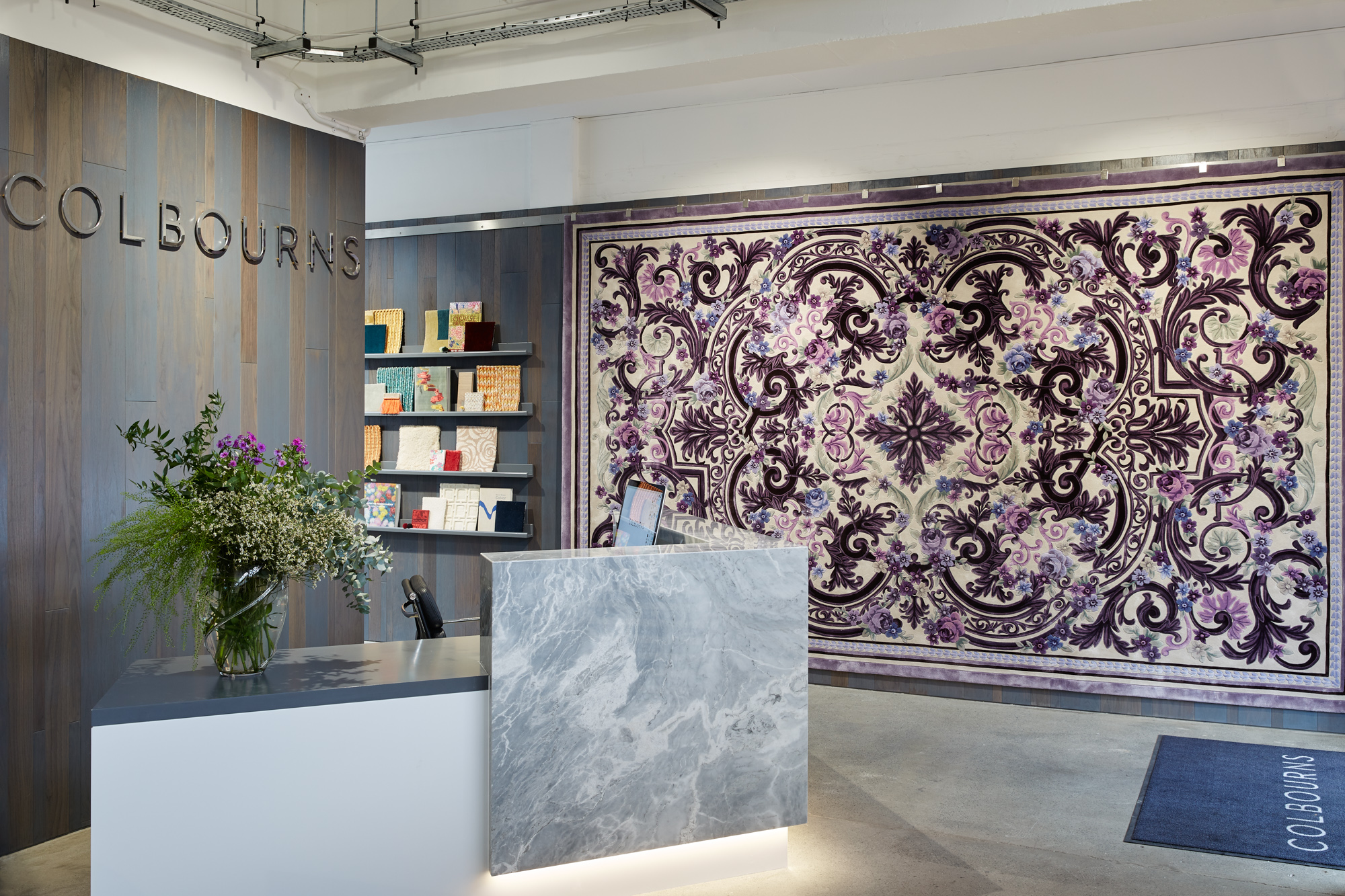
Thinking back to Maurizios 'Shoreditch Loft' project, we really wanted to emulate the industrial look of the exposed ceiling and polished concrete floors, using greys and whites. This colour palette would be a great background for any of the rugs that we were planning on displaying, a palette that wouldn't fight with any of our designs. We chose to use Spanish marble for our reception desk, making this a feature of the space and setting the tone for our improved brand. A grey stain to our wooden panelling that features on the long back wall, behind the reception and also in the window, is a soft transition to the clean lines of our joinery.
6. Were there any challenges? If so, how were they overcome?
Our main challenge has been to fit the different sectors of our business into one showroom. To carve up the floor space was our first challenge, but a very open dialogue between Colbourns and Maurizio has meant that we have used each square metre to the best of its ability.
7. What are your final thoughts on the overall design and finish?
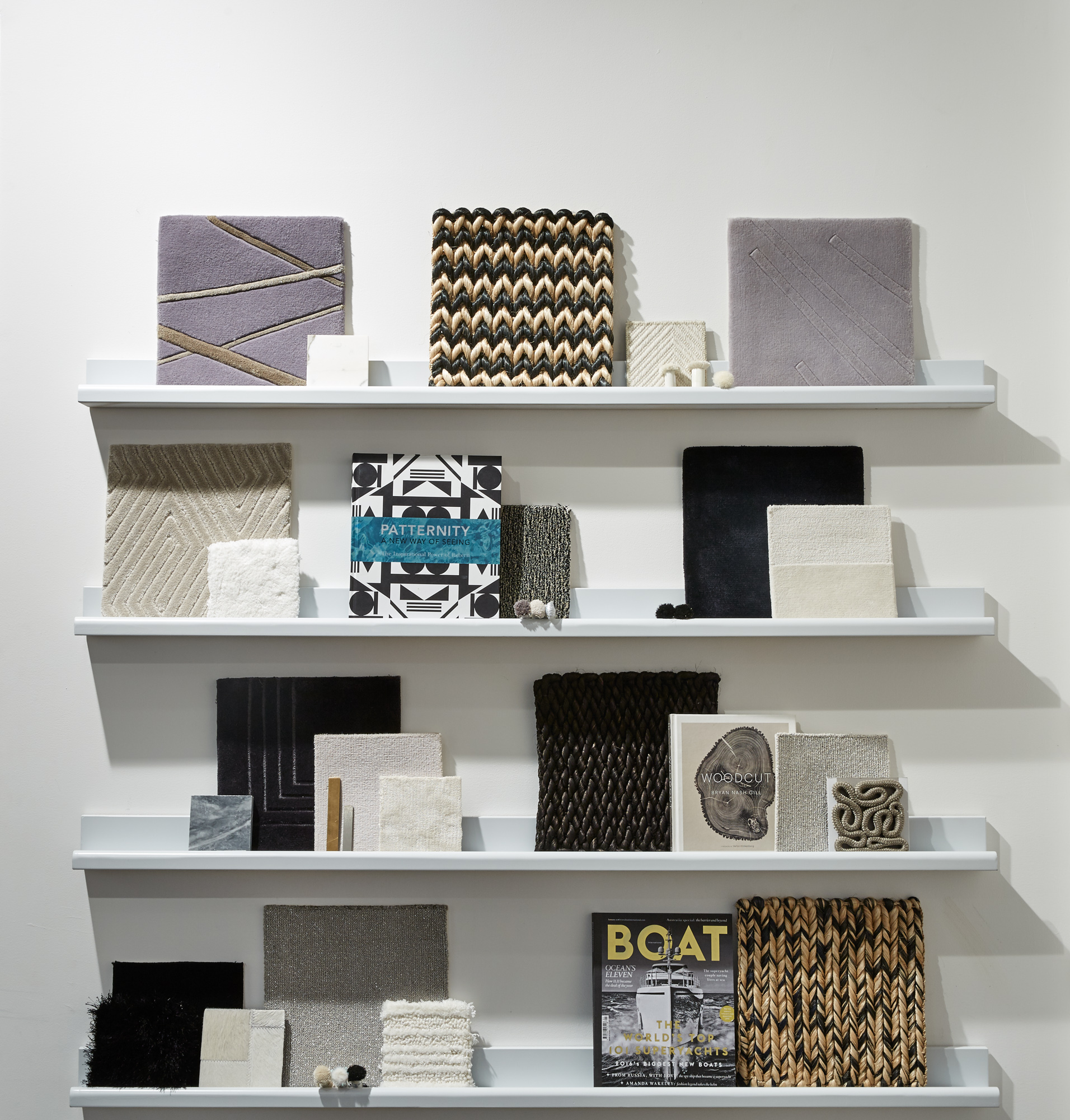
We very much wanted the final finish to have a gallery feel, but an interactive gallery, where everything can be touched, moved and altered when we needed. I feel that we have achieved this in every sense, from the riot of colours in our samples and rugs creating inspiration, to the moveable furniture and the our clean lines of our joinery that maintains a structure, creating a perfect balance in the showroom.
Maurizio's attention to detail has been what has stood out the most for me, which goes hand in hand with his dislike for any 'it will do' attitude from external contractors. Maurizio has high standards, which worked well for us in our quest for a high end, luxury showroom.
We love the industrial nature of the ceiling and flooring in Maurizio’s 'Shoreditch Loft' project, which was something that we wanted to emulate in our new showroom. We think that this comes across quite well in our finished space, where we have chosen to expose the tracking, lighting and heating/cooling systems in the ceiling.
Maurizio’s vision of making sure that our rugs took centre stage in the new space, like a gallery, has most definitely been brought to life. We love the rugs that are hung up on the walls, all framed with a deliberate border that was thought up during the space planning.
Overall we have achieved the brief that we set out to do. During the finishing stages of hanging rugs, storing boxes, putting away samples and even sorting out the kitchen, I have come to realise that Maurizio and I thought of everything, for everything. Maurizio has listened to our needs and subsequently things have been built that way, painted like that and are lit in that manor. It was my first time managing a project like this but Maurizio's experience, knowledge and patience has really pulled the whole thing together with a fantastic result.
Belgravia Rug | Maurizio Pellizzoni for Colbourns
Belgravia by Maurizio Pellizzoni, is an exclusive design collaboration with Colbourns.
An elegant collection of hand tufted rugs, Maurizio drew inspiration on the design from the decorative ironwork that lines the exquisite streets of SW1. The Belgravia collection features ornate bands of raised silk, defined with a crisp carving line that flows across a lustrous cut pile surface.
Belgravia is available online from the Maurizio Pellizzoni Boutique and Colbourns Showroom, where it can be seen on display in a choice of five colours.


